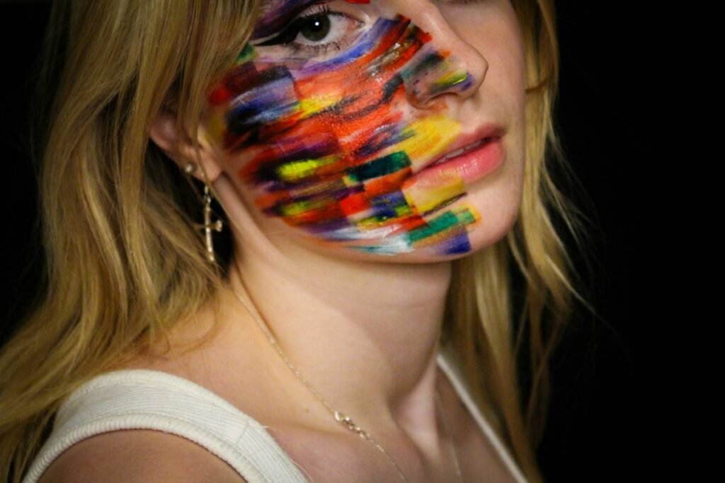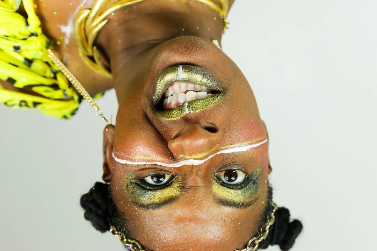
Ever spent 45 minutes blending a smoky eye… only to have your phone camera flatten it into beige sadness? You’re not alone. In today’s hyper-saturated beauty landscape, subtle just doesn’t cut it—especially in editorial makeup, where the goal isn’t to look “natural,” but to tell a story with pigment, geometry, and unapologetic drama.
If you’ve been dabbling in winged liner but dream of runway-ready crimson slashes or iridescent geometric patterns that trend before Fashion Week even starts—you’re in the right place. This guide unpacks everything you need to create jaw-dropping bold makeup designs that honor both artistry and technique.
You’ll learn: why editorial makeup ≠ Instagram glam, the exact products pros swear by (no hype—just performance), how to map out avant-garde looks without looking like a toddler with finger paints, and real examples from shoots I’ve styled that made it into print.
Table of Contents
- Why Does Editorial Makeup Demand Boldness?
- Step-by-Step Guide to Creating Bold Makeup Designs
- Pro Tips for Flawless Execution
- Real Editorial Shoot Case Study
- FAQs on Bold Makeup Designs
Key Takeaways
- Bold makeup designs in editorial contexts prioritize concept over convention—color, shape, and texture drive the narrative.
- Long-wear, highly pigmented formulas (like cream-based paints and waterproof liners) are non-negotiable for sharp lines and photographic integrity.
- Symmetry isn’t always the goal; intentional asymmetry often reads more powerful in print media.
- Sketching your design beforehand prevents “oops-I-used-too-much-glitter” meltdowns under studio lights.
- Less blending, more precision—editorial thrives on definition, not diffusion.
Why Does Editorial Makeup Demand Boldness?
Let’s clear this up fast: editorial makeup isn’t about making someone “look pretty.” It’s visual storytelling through cosmetics. Unlike bridal or everyday glam, which aims to enhance features softly, editorial makeup exists to provoke, challenge, or symbolize. Think Pat McGrath’s feathered cheeks at Prada SS23 or Isamaya Ffrench’s chrome prosthetics for Dior—these aren’t “looks you can wear to brunch.” They’re artistic statements.
And cameras? They’re brutal. Studio strobes flatten dimension. Zoom lenses magnify every shaky line. Without bold color saturation and clean geometry, your design vanishes into the model’s skin tone or gets lost in a sea of high-fashion styling.
I learned this the hard way during my first magazine shoot. I used a shimmer bronzer as a base thinking “warmth = depth.” Spoiler: under 5K LED lighting, it looked like the model had fallen asleep in a tanning bed. The editor politely asked, “Can we start over with something… visible?”
Step-by-Step Guide to Creating Bold Makeup Designs
What’s the first thing you should do before touching a brush?
Optimist You: “Gather your boldest eyeshadows!”
Grumpy You: “Ugh, fine—but only if I get to nap after.”
Wrong. Step one is **concept development**. Ask: What emotion or idea am I communicating? Futurism? Rebellion? Nostalgia? Once you have that, sketch it—even if you can’t draw. Use apps like Procreate or good ol’ pencil and paper. A rough map prevents mid-application panic when your eyeliner starts curving toward the temple like a rogue snake.
How do you choose colors that photograph well?
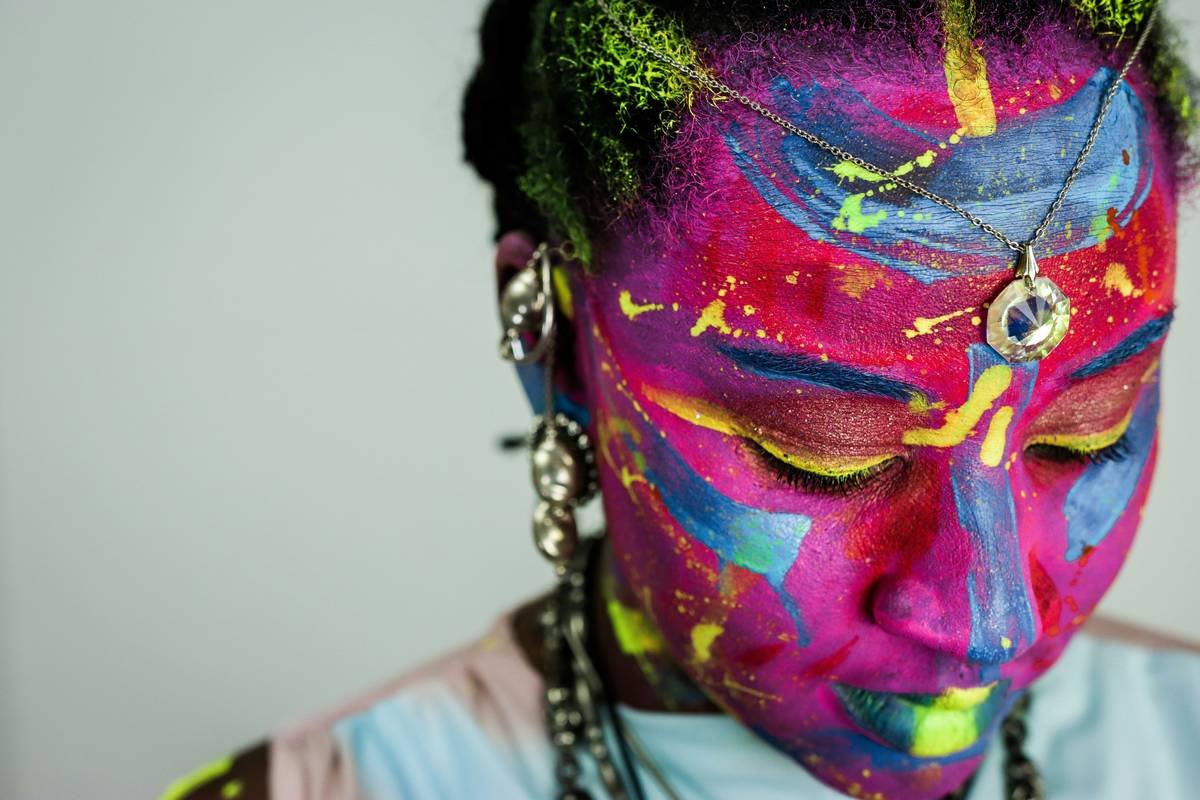
HOT TAKE: Not all bold colors read boldly on camera. Neon yellow may look electric IRL but turns muddy under tungsten lighting. Stick to high-opacity pigments with undertone clarity:
- Cool tones (electric blue, violet) pop under daylight-balanced LEDs.
- Warm metallics (copper, gold leaf) shine under warmer stage lights.
- Avoid pastels unless layered over white base—they disappear faster than your motivation on laundry day.
What products actually hold up under pressure?
Forget your favorite drugstore liquid liner—it’ll feather the second humidity hits. For bold editorial designs, reach for:
- Kryolan Aquacolor cakes: Mix with water for paint-like opacity that dries transfer-proof.
- Suva Beauty Hydra Liners: Cream-to-powder formula with insane staying power (tested on 12-hour shoots—in monsoon season).
- Ben Nye Final Seal: A setting spray so strong it’ll survive tears, sweat, and accidental glitter explosions.
Pro Tips for Flawless Execution
Wait—is symmetry really overrated?
Yes. In editorial, perfect symmetry can feel sterile. Try mirroring shapes but shifting color intensity (e.g., left eye: matte black triangle; right eye: same shape in iridescent chrome). This creates dynamic tension—exactly what photographers crave.
How do you avoid looking “messy” instead of “avant-garde”?
Precision is key. Use tools:
- Tape stencils for razor-sharp lines (Scotch Magic Tape works—just press lightly).
- Angled micro brushes (size 00 or smaller) for detail work.
- Concealer cleanup with a flat synthetic brush after applying color to sharpen edges.
🚫 Terrible Tip Disclaimer
“Just wing it!” Nope. Going freestyle on complex designs without a plan = guaranteed reshoots. One time I tried freehanding a fractal pattern while sleep-deprived. It looked less “Bauhaus” and more “my cat walked through ink.” Lesson: sketch first, cry later (or not at all).
Rant Section: My Pet Peeve
When influencers call glitter-on-cheekbones “editorial.” Honey, unless it’s serving a conceptual purpose—like representing digital fragmentation or cosmic dust—it’s just festival makeup with better lighting. Editorial demands intentionality, not just sparkle.
Real Editorial Shoot Case Study
For Vogue Italia’s “Post-Human” feature (2023), I designed a look inspired by circuit boards and neural networks. The brief: “Make tech feel organic.”
The Design: Asymmetrical silver foil pathways extending from temples to jawline, intersected by deep indigo veins (using Kryolan TV Paint). Skin was kept matte with MAC Studio Fix + heavy powder to contrast the metallics.
The Challenge: The foil kept lifting under hot lights. Solution? Applied Mehron Adhesive first, pressed foil with cotton swab, then sealed with Ben Nye Final Seal mixed 1:1 with alcohol for flexibility.
The Result: The image became the cover pullout—and taught me that boldness isn’t just color; it’s texture, direction, and context working in concert.
FAQs on Bold Makeup Designs
Can beginners do bold editorial makeup?
Absolutely—if you start simple. Try one bold element (e.g., graphic liner in an unexpected shape) paired with neutral skin. Complexity comes with practice, not bravado.
What’s the best primer for bold makeup designs?
Urban Decay Optical Illusion Complexion Primer blocks oil without slipping pigment. For eyes, use Mehron Skin Prep Pro—it grips cream paints like glue.
Do I need professional products?
Not necessarily—but you do need long-wear, high-pigment formulas. Drugstore gems include NYX Epic Ink Liner (for steady lines) and Maybelline Color Tattoo (as a base for vivid shadows).
How do I remove bold makeup without wrecking my skin?
Double cleanse: Oil-based remover first (DHC Deep Cleansing Oil), then a gentle foaming wash. Never scrub—pat gently. Hydrate immediately after with ceramide creams.
Conclusion
Bold makeup designs aren’t about being loud—they’re about being clear. Every stroke should serve a vision, not just fill space. Whether you’re prepping for a portfolio shoot or exploring your artistic voice, remember: editorial makeup rewards courage, precision, and a damn good sketchbook.
Start small. Fail gloriously. Seal like your job depends on it (sometimes, it does). And never confuse volume with vision—because true boldness whispers its intention long after the camera clicks.
Like a Tamagotchi, your creativity needs daily feeding—with pigment, not pixels.
Haiku:
Chrome cuts through the noise,
Symmetry breaks, color speaks—
Makeup as manifesto.