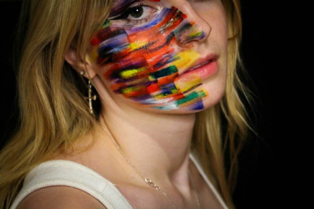
Most makeup artists hit a creative wall when translating high-concept runway looks into wearable editorial statements. They mimic trends—but never own them. The result? Forgettable shoots drowned in overused glitter and predictable contouring. Vibrant face art changes everything. It’s not just color—it’s visual storytelling with pigment, geometry, and fearless intent.
Why Traditional Techniques Fall Short for Bold Editorial Looks
Standard foundation blending and soft smoky eyes won’t cut it when your brief demands disruption. Editorial makeup lives in the tension between fashion and fine art—and most pros weren’t trained to navigate that space. They layer product without purpose. Color becomes decoration, not dialogue.
And here’s the brutal truth: skin prep built for weddings collapses under neon acrylics or water-activated pigments. You need architecture—not just aesthetics.
Mastering Vibrant Face Art: A Step-by-Step Framework
Sketch Before You Swatch
Grab a pencil—yes, literally. Map symmetry, negative space, and focal points on tracing paper over reference shots. This isn’t about replicating a look; it’s about reverse-engineering its emotional impact.
Prime Like a Muralist
Ditch dewy primers. Opt for grip-enhancing bases like Mehron Prep or even diluted PVA glue (yes, really). Matte isn’t flat—it’s a canvas.
Select Pigments with Intention
Not all brights behave the same. Some bleed. Others oxidize. Test under mixed lighting before committing.
| Medium | Best For | Drying Time | Removal Difficulty |
|---|---|---|---|
| Water-Activated Face Paints | Bold lines, graphic shapes | 30–60 sec | Low (soap + water) |
| Acrylic Ink + Mixing Medium | Translucent washes, gradients | 2–5 min | High (oil-based cleanser needed) |
| Cake Liners (e.g., Kryolan Aqua) | Ultra-fine detailing | 15–30 sec | Medium |
| Pigment + Alcohol Base | Long-wear metallics | Under 10 sec | Very High (requires balm + micellar) |
The Industry Secret: Controlled Imperfection Wins Every Time
Top editorial artists don’t chase sterile precision. They lean into “happy accidents.” A slightly feathered edge? That’s organic texture. An uneven saturation? Now it breathes. The math is simple: rigid symmetry feels digital; subtle asymmetry reads human.
Here’s what no one admits: the most viral vibrant face art shots from Vogue Italia or i-D were edited to *enhance* minor flaws—not erase them. Your job isn’t perfection. It’s provocation.
FAQ: Real Questions from Working Artists
How do I prevent vibrant colors from staining skin?
Always apply a barrier spray (like Blue Marble Sealer) before intense pigments. Post-shoot, cleanse immediately with cleansing balm—not foaming wash.
Can vibrant face art work on deeper skin tones?
Absolutely. Avoid pastels that vanish. Instead, use jewel-toned blues, emerald greens, and electric purples—they contrast *with* depth, not against it.
What camera settings capture true color accuracy?
Shoot in RAW with custom white balance. Avoid fluorescent lighting—it murders magentas and cyans. Golden hour or studio LEDs at 5600K are ideal.