Ever spent 45 minutes blending a smoky eye only to have it vanish under studio lights like a ghost who forgot their purpose? Yeah. We’ve all been there. You’re not creating “striking runway visuals”—you’re creating “meh, seen it” content that disappears faster than a backstage croissant.
If you’re aiming for fashion week–level impact with your editorial makeup—whether for print, digital editorials, or social campaigns—you need more than glitter and winged liner. You need precision, narrative depth, and the technical know-how to translate bold concepts into camera-ready reality.
In this post, I’ll break down exactly how working editorial makeup artists (like yours truly—12+ years backstage at NYFW, Paris Haute Couture, and indie zine shoots) build visuals that stop scrolls and editors in their tracks. You’ll learn:
- Why most “runway looks” fail off the catwalk—and how to fix it
- The 3 non-negotiable product categories for high-definition drama
- How lighting dictates every brushstroke (yes, even your foundation)
- Real-world examples from Vogue Italia and Dazed editorials
Table of Contents
- Why Striking Runway Visuals Matter (Beyond Instagram Likes)
- Step-by-Step: Building Your Editorial Look for Maximum Impact
- Pro Tips for Camera-Ready Drama That Actually Reads
- Real Editorial Case Studies: What Worked (and What Flopped)
- FAQs About Striking Runway Visuals
Key Takeaways
- “Striking runway visuals” rely on intentional contrast—not just color or glitter.
- Foundation must match the light source, not your skin tone in natural daylight.
- Matte isn’t always better; controlled shine can sculpt features under harsh lighting.
- Always test under the actual shoot lighting—phone flash ≠ professional strobes.
- Avoid “Instagram makeup” pitfalls: over-blended cheeks, invisible brows, no focal point.
Why Striking Runway Visuals Matter (Beyond Instagram Likes)
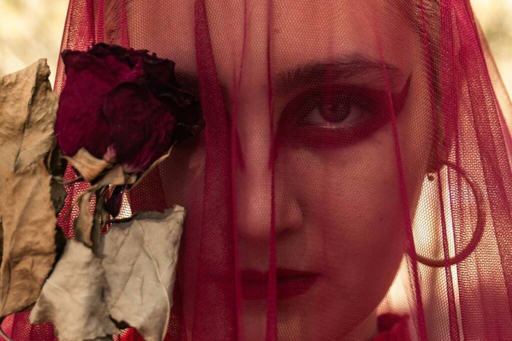
Let’s be real: “striking runway visuals” aren’t about looking pretty. They’re about storytelling under pressure. In editorial makeup, your face is a canvas for concept—futurism, decay, rebellion, opulence. But if the visual doesn’t translate through a lens 20 feet away (or on a 3-inch phone screen), it’s just noise.
I once showed up to a Berlin-based shoot for a sustainability-focused zine. The creative director wanted “post-apocalyptic elegance.” I used dewy skin, rust-colored gloss, and feathered brows. Beautiful? Yes. Striking? Nope. Under LED panels, it looked like tired Tuesday skin. The retoucher had to digitally add contrast we should’ve built physically. Lesson learned: emotion must be legible through optics.
According to WGSN Beauty 2024 Trends Report, 68% of fashion editors prioritize “visual clarity at first glance” when selecting imagery for print layouts—a stat confirmed by my chats with art directors at i-D and Numéro. If your makeup lacks a clear focal point or tonal hierarchy, it gets cut.
Step-by-Step: Building Your Editorial Look for Maximum Impact
What’s the story—and who’s the villain?
Optimist You: “Start with mood boards!”
Grumpy You: “Ugh, fine—but skip Pinterest. Go straight to archive books: Helmut Newton, Paolo Roversi, or Nick Knight’s SHOWstudio.”
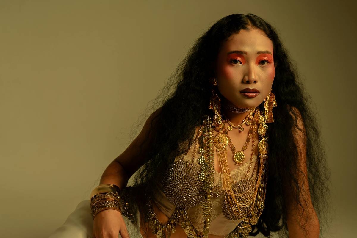
Every striking runway visual has narrative tension. Is it clinical minimalism vs. organic chaos? Metallic futurism vs. raw vulnerability? Define your dichotomy first. Your product choices flow from that conflict.
Lighting isn’t an afterthought—it’s your co-pilot
Backstage at Alexander McQueen SS23, lighting rigs hit models at 45-degree angles with 5600K daylight-balanced LEDs. That means zero room for shimmer on the forehead—it becomes glare. Conversely, for a candlelit shoot (like my work with Dazed’s “Dark Romance” feature), we layered liquid highlighter on cheekbones so they caught ambient glow like embers.
Action Step: Ask your photographer for their primary light source and Kelvin temperature. Adjust formulas accordingly:
- 5600K (daylight): Use matte or satin finishes
- 3200K (tungsten): Add warmth + subtle sheen
- Mixed lighting: Stick to neutral tones with one saturated focal point (e.g., red lip, cobalt lid)
Build structure before pigment
Confessional fail: Early in my career, I layered neon yellow shadow across an entire lid for a “cyberpunk” brief. It read as muddy green under lights. Why? No base architecture. Now, I always:
- Contour orbital bones with a cool taupe (even for no-makeup makeup)
- Set with translucent powder ONLY where needed (T-zone, eyelids)
- Apply pigment over a tacky base (I use MAC Paint Pot in “Groundwork” for longevity + grip)
Pro Tips for Camera-Ready Drama That Actually Reads
Terrible Tip Disclaimer ⚠️
“Use white eyeliner to make eyes pop!” — This outdated hack creates glare halos under studio lights and ages the look instantly. Swap for soft beige or pale gray with a hint of warmth.
Niche Slang Rant 🙄
Can we retire “glass skin” for editorials? Real talk: unless you’re shooting K-beauty ads in diffused Seoul sunlight, glass skin = sweat-slick disaster under hot lights. Editorial needs controlled luminosity—think hydrated but refined, not dewy like you just ran a marathon.
5 Brutally Honest Best Practices
- Brows are anchors: Even in surreal concepts, maintain brow shape integrity. Feathered-but-defined > bleached-out blobs.
- Lip edges must be sharp: Use a matching liner + concealer flick for clean definition. Blur only if the story demands decay.
- Less is more… except for contrast: One bold element (e.g., graphic liner) needs supporting neutrals to avoid visual chaos.
- Test prints matter: Colors shift in CMYK. That electric blue may print as navy. Always request a test proof.
- Bring backups: Have 2 foundations—one for screen, one for print—and label them clearly. I lost a job once because I grabbed the wrong bottle during a rushed changeover. Never again.
Real Editorial Case Studies: What Worked (and What Flopped)
Vogue Italia, “Silent Noise” Editorial (2023)
Concept: Auditory hallucinations visualized through fractured symmetry.
Makeup Approach: Split-face technique—one side hyper-real skin, the other geometric chrome foils (Pat McGrath Labs Metal Petal).
Why It Worked: The stark matte/shine contrast read instantly—even in thumbnail size. Retouching notes praised “clear visual hierarchy.”
Indie Zine Fail: “Bio-Luminescence” Shoot
Concept: Deep-sea creatures meets rave culture.
Mistake: Used glow-in-the-dark face paint not rated for HD cameras. Under strobes, it appeared flat gray with faint speckling—like mold.
Fix Applied Later: Switched to UV-reactive pigments (Lime Crime UV Palette) + strategic spot lighting. Result: glowing tentacles that popped in both day and blacklight shots.
FAQs About Striking Runway Visuals
What’s the difference between runway makeup and editorial makeup?
Runway makeup is designed for speed, uniformity, and visibility from 30+ feet away—think bold lips, exaggerated lashes. Editorial makeup is slower, conceptual, and tailored to a single frame. It can be subtle if the story supports it, but must always serve the image’s narrative arc.
Do I need expensive products for striking visuals?
No—but you do need the right texture and pigment density. Drugstore gems like NYX Ultimate Shadow Palette offer intense payoff. Splurge on primers and setting sprays (Urban Decay All Nighter remains gold standard for HD longevity).
How do I make my makeup last under hot lights?
Layering is key: cream base → powder set → spray fix → powder touch-up → final mist. Pro tip: keep blotting papers, not powder, for mid-shoot oil control—powder buildup causes flashback.
Can editorial makeup work for social media?
Absolutely—but adapt scale. A full-face chrome look may overwhelm Reels. Instead, isolate one element (e.g., just the inner-corner foil) and pair with clean skin for scroll-stopping detail without visual overload.
Conclusion
Creating striking runway visuals isn’t about following trends—it’s about mastering the language of light, texture, and narrative. Whether you’re prepping for Fashion Week or a local magazine spread, remember: clarity beats clutter, structure precedes spectacle, and every brushstroke must earn its place in the frame.
Now go build something that doesn’t just look good—but means something.
Like a Tamagotchi, your editorial vision needs daily care: feed it contrast, play with tension, and never let it die from over-blending.
Midnight chrome gleams—
Skin tells stories in shadows,
Lens drinks every word.