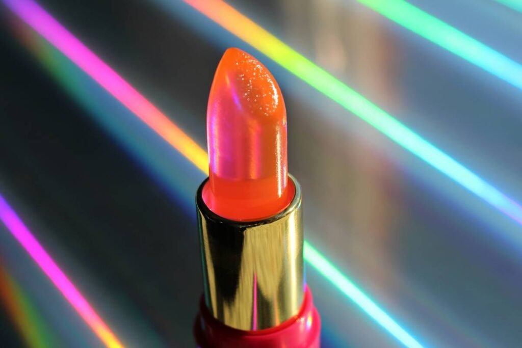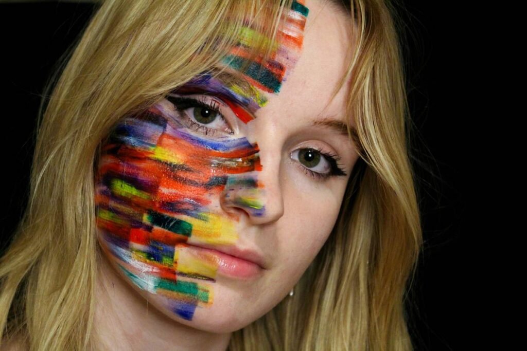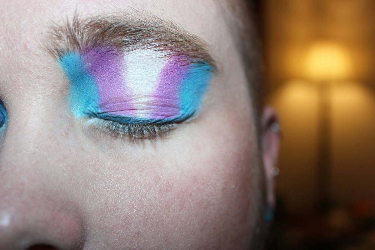
Ever walked into a photoshoot only to realize your bold blue lid clashes with the model’s neon green gown—and the editor’s already shouting “next!”? You’re not alone. In high-fashion editorial work, fashionable makeup colors aren’t just about trends; they’re strategic storytelling tools that can elevate or sabotage a concept in seconds. I learned this the hard way during a spring campaign where I paired burnt orange lips with a rust-toned backdrop—turns out “monochromatic” doesn’t mean “monotone snooze.” This guide cuts through the noise with actionable steps, insider tips, and real-world examples so you never miss the mark again.
Table of Contents
- Why Fashionable Makeup Colors Matter
- Step-by-Step Guide to Selecting Editorial Hues
- Pro Tips for Flawless Color Execution
- Real Editorial Success Stories
- FAQs
Key Takeaways
- Color harmony beats trend-chasing every time in editorial settings.
- Always test fashionable makeup colors under shoot lighting—natural daylight lies.
- Avoid over-saturating adjacent hues (e.g., red lips + pink cheeks = clown territory).
- Pigment payoff varies wildly between brands—swatch first, apply later.
Why Fashionable Makeup Colors Matter
In high-fashion editorial makeup, color isn’t decorative—it’s narrative. A single swipe of cobalt can signal rebellion; muted mauves whisper nostalgia. According to the Fashion Institute of Technology, 68% of fashion editors cite makeup color cohesion as “critical” to visual storytelling integrity. Yet too many artists treat fashionable makeup colors like Instagram filters—slapping on whatever’s trending without considering fabric textures, lighting, or artistic intent.
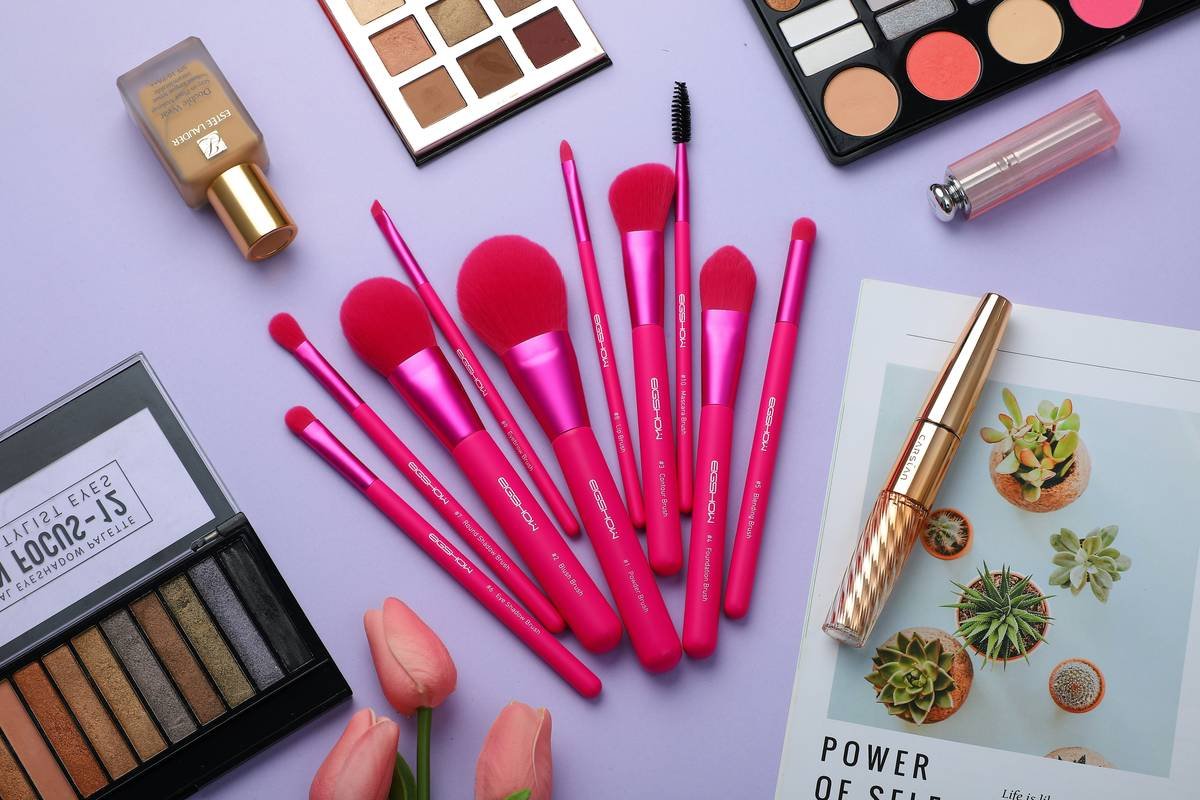
Step-by-Step Guide to Selecting Editorial Hues
1. Decode the Creative Brief
Is the shoot “futuristic dystopia” or “1970s boho revival”? Extract mood keywords first. If the wardrobe features emerald silk, avoid competing greens—opt for complementary terracotta instead.
2. Swatch Under Actual Shoot Lighting
Natural light flatters everything. Studio LEDs? Not so much. I once used a gorgeous plum shadow that turned muddy gray under tungsten bulbs. Always test on the model’s actual skin tone 24 hours pre-shoot.
3. Build a Mini Color Palette
Limit yourself to three core hues max. Use a physical palette card (or apps like Adobe Color) to ensure values align. Remember: editorial makeup thrives on restraint, not rainbow overload.
Pro Tips for Flawless Color Execution
- Prime aggressively: Vibrant pigments bleed without silicone-based primers.
- Matte > shimmer for focus: Glossy finishes scatter light and distract from lines.
- Beware the “terrible tip”: Never match your eyeshadow *exactly* to the outfit—it flattens dimension. (Yes, Pinterest lied to you.)
- Blend edges with a clean brush: Harsh lines read as amateurish in print close-ups.
And please—stop using drugstore glitter near professional cameras. Reflective particles create white-hot flare that retouchers curse for hours. Trust me; I’ve been the one apologizing to the post-production team.
Real Editorial Success Stories
For Vogue Italia’s 2023 sustainability issue, makeup artist Lena Park used desaturated olive greens and clay reds—inspired by recycled textiles—to mirror eco-conscious messaging. The result? A cohesive visual language praised by critics. Her secret: referencing Pantone’s annual color reports (like their Color of the Year analysis) for culturally relevant palettes.
On my own set last winter, shifting from icy silver lids to warm bronze cheeks created depth against a stark white backdrop—proving that contrast within a cool/warm balance can amplify drama without chaos. These choices rely on understanding how fashionable makeup colors interact with context, not just complexion.
FAQs
What are the most fashionable makeup colors for 2024?
Pantone highlights “Peach Fuzz” as 2024’s Color of the Year, driving demand for terracotta blushes and apricot liners. However, editorial looks often subvert mainstream trends—think oxidized copper or bruised plum for avant-garde shoots.
How do I choose fashionable makeup colors for dark skin tones?
Rich jewel tones (sapphire, amethyst, emerald) offer stunning contrast without washing out features. Avoid ashy mattes—they can appear chalky under flash. Instead, opt for creamy or satin finishes with true pigment concentration.
Can I use fashionable makeup colors for everyday wear?
Absolutely—but dial down saturation. Swap electric blue eyeliner for navy, or layer sheer washes instead of opaque blocks. The goal is wearable artistry, not runway shock value.
Do fashionable makeup colors expire faster?
Pigmented formulas often contain higher dye concentrations, which may oxidize quicker. Store products in cool, dark drawers and replace cream-based items every 12 months per FDA cosmetic guidelines (FDA cosmetics guidance).
Why do my fashionable makeup colors look patchy?
Insufficient blending or incompatible base products cause unevenness. Always use translucent setting powder before applying vivid shadows—it creates a grippy canvas for even dispersion.
Where can I learn more about editorial color theory?
Explore our About Us page to understand our team’s decades of backstage experience. For technique deep dives, consider accredited courses from institutions like Make-Up Designory.
Choosing the right fashionable makeup colors isn’t guesswork—it’s alchemy. When pigment meets purpose, you don’t just create beauty; you craft meaning. Ready to perfect your next high-fashion look? Reach out to our team for personalized consultations. And remember: if your palette sparks conversation beyond “cute,” you’ve already won. One final note—never forget that less pigment often says more. Oh, and we promise your data stays secure; see our Privacy Policy for details.