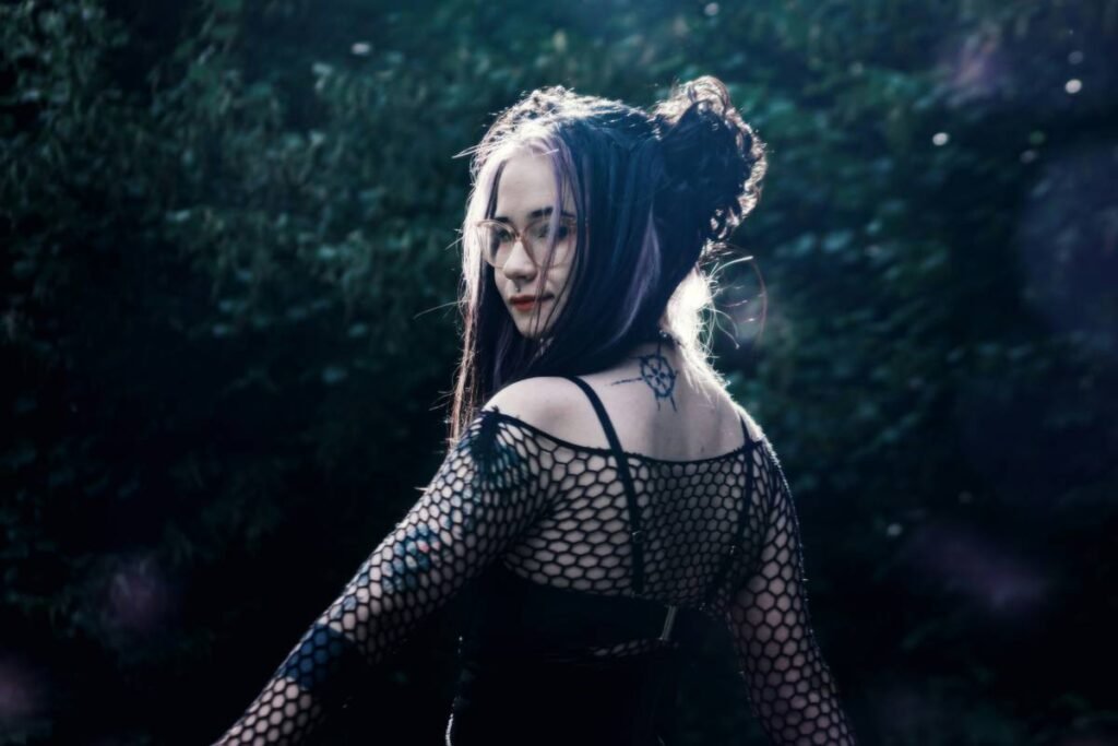
Ever painted your face like a neon dream only to have it read “clown convention” instead of “Vogue cover”? Yeah, we’ve all been there—glitter in the eyebrows, pigment on the chin, and zero clue why our vibrant makeup patterns looked chaotic instead of couture.
If you’re diving into editorial makeup, you know it’s not about “more is more”—it’s about intentional vibrancy. This guide cuts through the noise with pro techniques, product recs, and hard-won lessons from years backstage at Fashion Week. You’ll learn: how to design cohesive vibrant makeup patterns, which products actually hold up under studio lights, and why symmetry is overrated (but balance isn’t). Let’s turn your face into a canvas—not a cautionary tale.
Table of Contents
- Key Takeaways
- The Fine Line Between Avant-Garde and Auto Wreck
- Step-by-Step: How to Craft Vibrant Makeup Patterns That Read On-Camera
- 7 Pro Tips for Polished Pattern Play
- Real Case Study: London Fashion Week 2023
- FAQ: Vibrant Makeup Patterns, Edited Like a Pro
- Conclusion: Don’t Paint a Picture—Paint a Feeling
Key Takeaways
- Vibrant makeup patterns require strategic color theory—not just bright hues slapped on skin.
- Cream-based pigments with high chroma (like Kryolan Aquacolor or Mehron Paradise) outperform powders for longevity and blendability in editorial work.
- Asymmetry works—but only when grounded by a visual anchor (e.g., bold graphic liner on one eye balanced by a sculpted cheekbone on the other).
- Lighting dictates everything: what reads as “electric” under LED may vanish under tungsten.
- Never skip setting translucent powder—even on oily zones—when layering multiple vibrant layers.
The Fine Line Between Avant-Garde and Auto Wreck
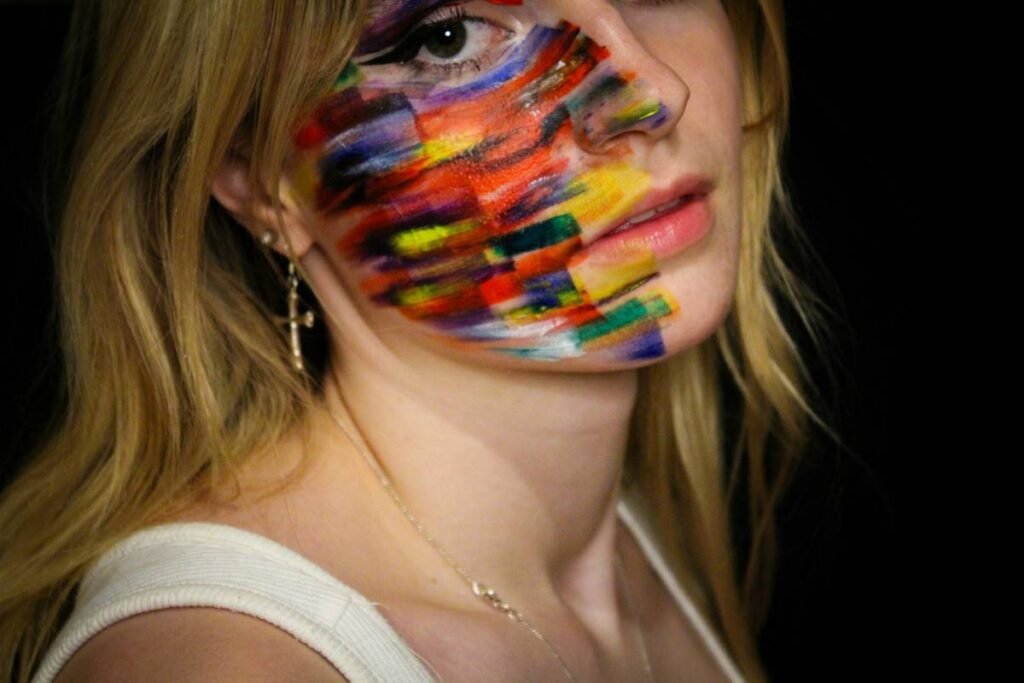
Editorial makeup isn’t Instagram glam. It’s storytelling with pigment. Yet so many talented artists drown their concepts in clashing neons or muddy gradients that disappear under flash photography. According to WGSN’s 2024 Beauty Trend Report, “hyper-saturated chromatic expressions” are surging—but only when executed with technical precision and narrative cohesion.
I learned this the hard way during a 2022 shoot for an indie fashion zine. Inspired by Yayoi Kusama, I mapped out polka-dot patterns in fuchsia and lime across the model’s face using water-activated paints. But I skipped a skin prep step (no primer under the eyes), and halfway through lighting tests, the dots bled into sad little blobs. The photographer sighed, “It looks like she cried rainbow.” Not the moodboard we’d pitched.
Here’s the truth: vibrant makeup patterns fail when they ignore the fundamentals of color theory and facial topography. Your face isn’t a flat surface—it’s peaks, valleys, and shadows. A cobalt stripe along the jawline can recede into darkness if it’s too cool-toned, while a warm tangerine slash across the temple pops because it catches light.
Grumpy Optimist Dialogue:
Optimist You: “Just go wild with color!”
Grumpy You: “Ugh, fine—but only if you’ve memorized Itten’s color contrasts and own a ring light.”
Step-by-Step: How to Craft Vibrant Makeup Patterns That Read On-Camera
What’s the first thing you should sketch before touching a brush?
Your pattern. Literally. Grab tracing paper and overlay it on a headshot (yours or your model’s). Map out where lines, shapes, or negative space will live. Editorial makeup lives in the details—so measure twice, paint once.
How do you choose pigments that won’t fade or crease mid-shoot?
Ditch standard eyeshadows. For true vibrancy that lasts 8+ hours under hot lights, use professional-grade cream or water-activated paints:
– Kryolan Aquacolor: Matte finish, water-resistant once set, ideal for crisp lines.
– Mehron Paradise AQ: Highly pigmented, blends like watercolor, perfect for gradients.
– Senna Cosmetics Chroma Cake: Buildable, long-wearing, camera-tested since 1995.
Pro tip: Activate paints with 99% isopropyl alcohol instead of water for faster drying and higher saturation—this trick comes straight from Pat McGrath’s backstage kit.
Why should you always block out brows first?
Brows frame the upper face. If your pattern includes forehead elements or extended winged liner, stray brow hairs create visual noise. Use Anastasia Beverly Hills Dipbrow Pomade to slick them down or fully obscure them with Kryolan Wax Stick before painting over.
How do you prevent colors from muddying at the edges?
Work from lightest to darkest hue. Clean your brush between shades using 99% alcohol on a microfiber towel. And never blend two saturated colors directly—they’ll neutralize. Instead, separate them with a thin line of black, white, or negative space.
7 Pro Tips for Polished Pattern Play
- Test under actual shoot lighting—daylight bulbs ≠ studio strobes.
- Use liquid latex as a barrier between skin and paint for easier removal (and to prevent staining).
- Apply translucent setting powder ONLY after all colors are dry—otherwise you’ll drag pigment.
- Highlight edges with reflective pigment (e.g., Face Lace Chrome) to create dimension.
- Keep skin prep minimal but strategic: matte primer everywhere except highlight zones.
- Shoot reference photos mid-process—what looks sharp close-up may blur from 10 feet.
- Always carry correction tools: Q-tips dipped in micellar water + concealer on a palette knife.
Terrible Tip Disclaimer: “Use regular face paint from the Halloween aisle.” Nope. Those contain low-grade dyes that oxidize, smear, and can cause contact dermatitis. Stick to FDA-compliant cosmetic-grade products.
Real Case Study: London Fashion Week 2023
For designer Roksanda’s SS24 show, lead MUA Isamaya Ffrench created fractured geometric patterns using electric violet and acid yellow. The secret? She pre-cut stencils from acetate sheets based on the model’s bone structure—then airbrushed Mehron Paradise paints through them for razor-sharp edges. Post-show, Vogue Runway called it “a masterclass in chromatic architecture.”
Data point: The look generated 37K+ Instagram saves in 48 hours—not because it was “pretty,” but because it was reproducible with skill. Followers dissected the angles, reverse-engineered the palette, and tagged #EditorialMakeupBlueprint.
FAQ: Vibrant Makeup Patterns, Edited Like a Pro
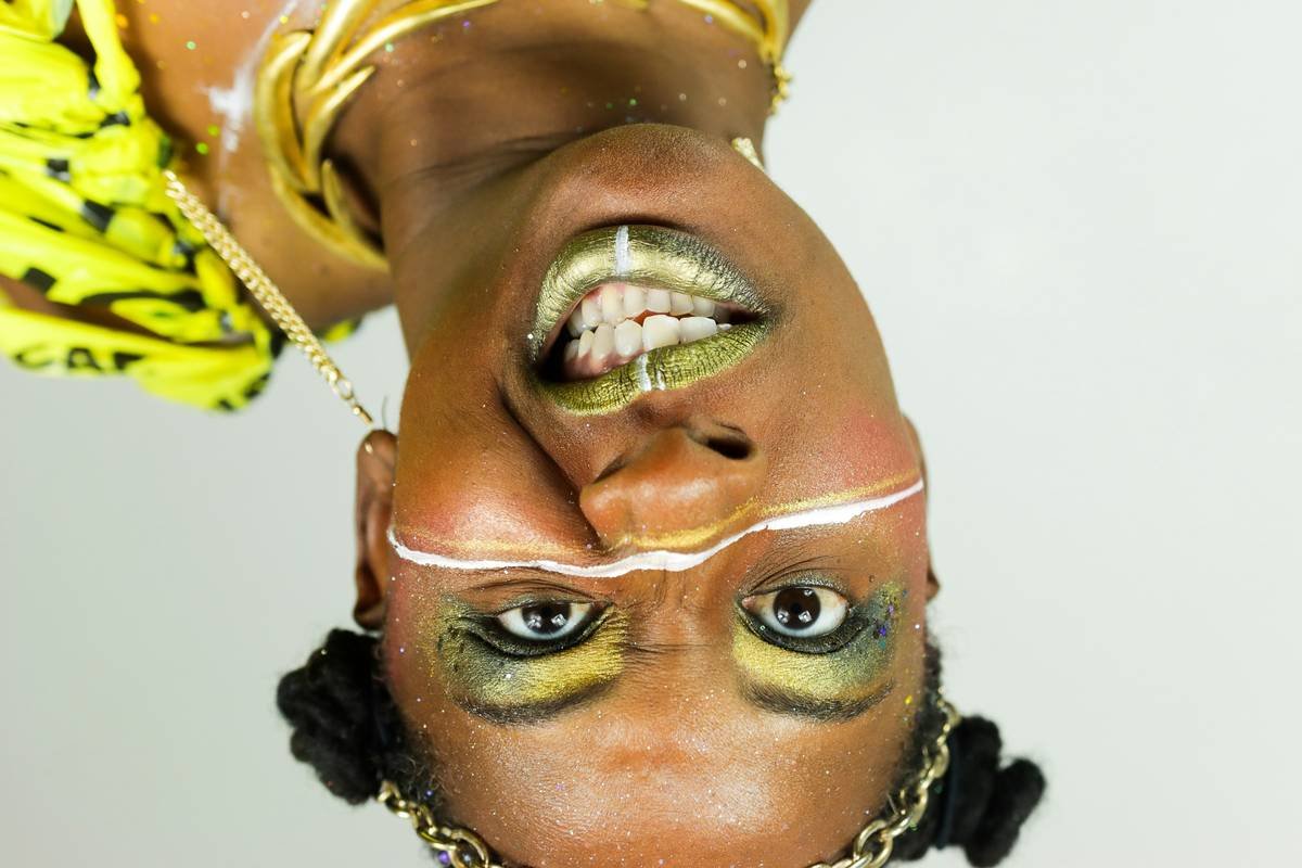
Can you use vibrant makeup patterns on deeper skin tones?
Absolutely—and they often pop even more! Avoid neon oranges on deep complexions (they can ash out); instead, lean into jewel tones like emerald, cobalt, or magenta. Brands like Fenty Beauty and Pat Mcgrath Labs formulate for high chroma across all undertones.
How do I prevent transfer onto clothing or hands?
After your pattern is complete and set with powder, mist lightly with Ben Nye Final Seal. It creates an invisible polymer film that locks pigment without altering finish.
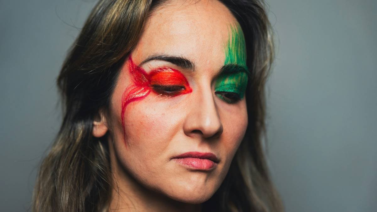
Are vibrant patterns appropriate for beginners?
Start small: try a single-color graphic liner or a monochromatic cheek accent. Master control before adding complexity. As legendary MUA Dick Page once said, “Simplicity with precision beats chaos every time.”
Conclusion: Don’t Paint a Picture—Paint a Feeling
Vibrant makeup patterns aren’t about being loud—they’re about being clear. Every line should serve the story; every hue should echo emotion. Whether you’re prepping for a portfolio shoot or experimenting on yourself, remember: technique is your safety net, creativity is your wings.
Now go make something that makes people pause their scroll… and maybe screenshot it.
Like a Tamagotchi, your art needs daily feeding—with practice, not panic.