Ever spent 45 minutes blending blush only to look like you’ve been slapped by a confused raccoon? Yeah. We’ve all been there. But what if your blush could do more than just mimic a post-Zoom-call flush? What if it became a brushstroke in a living canvas—bold, unexpected, and utterly editorial?
This isn’t your “blend-till-you-disappear” routine. This is abstract blush techniques: where color lives beyond cheekbones, rules bend, and makeup becomes art. In this guide, you’ll learn how top editorial artists use unconventional placement, texture play, and chromatic theory to transform faces into mood pieces. Whether you’re prepping for a photoshoot, building your portfolio, or just tired of looking like everyone else on your feed, you’ll walk away with practical steps, pro product recs, and hard-won lessons (like the time I swatched cobalt blush under a model’s jawline… in broad daylight… without setting spray).
Table of Contents
- Why Are Abstract Blush Techniques Suddenly Everywhere?
- How to Execute Abstract Blush Like an Editorial Pro
- 7 Best Practices for Flawless Abstract Blush Application
- Real-World Examples from Runway & Editorial Shoots
- Frequently Asked Questions About Abstract Blush
Key Takeaways
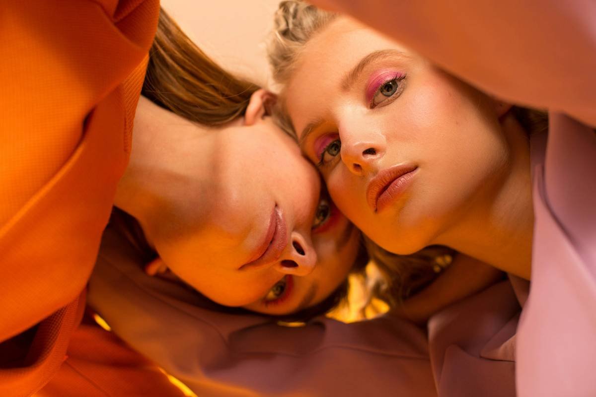
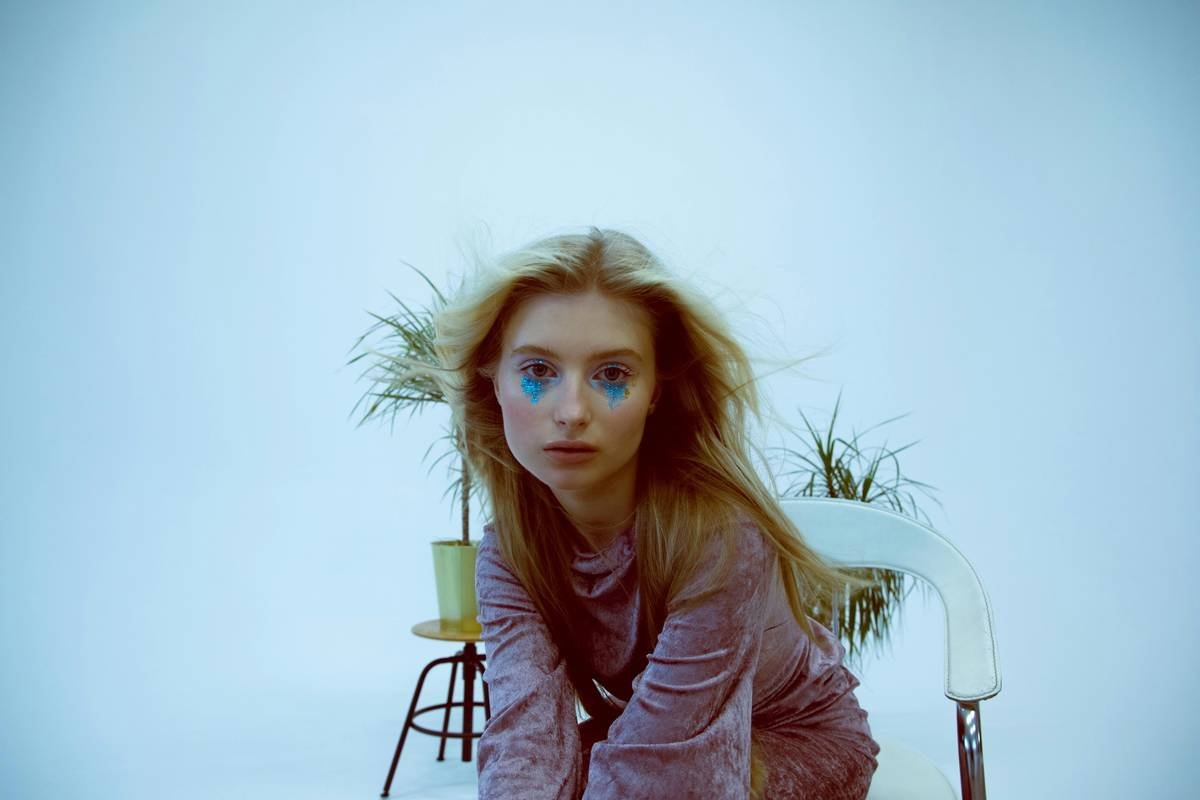
- Abstract blush techniques defy traditional placement—think temples, jawlines, even eyelids.
- Texture contrast (cream + powder) and color temperature (cool vs. warm) are key for dimension.
- Editorial makeup prioritizes concept over symmetry; imbalance can be intentional.
- Use translucent setting sprays sparingly—over-matting kills luminosity essential to abstract looks.
- Start subtle. Even avant-garde art needs a foundation that doesn’t crack mid-shoot.
Why Are Abstract Blush Techniques Suddenly Everywhere?
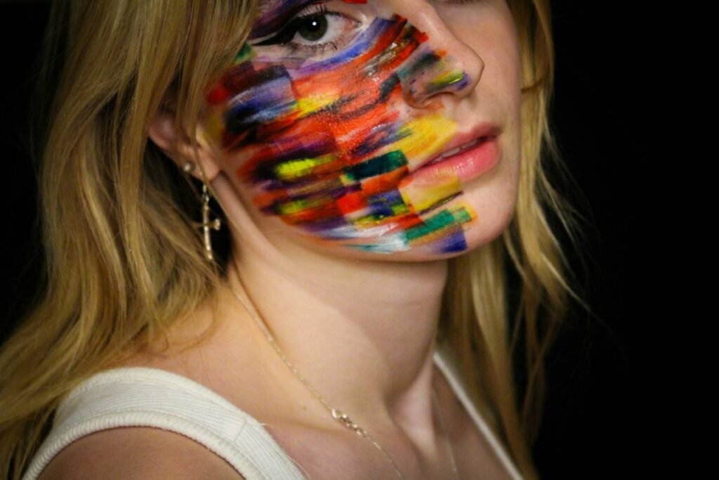
If you’ve scrolled through Vogue Italia’s latest spreads or watched backstage footage from Coperni or Rick Owens, you’ve seen it: blush arcs sweeping from cheekbones to hairlines, geometric streaks in matte terracotta, or iridescent swipes that catch light like shattered glass. This isn’t accidental—it’s editorial rebellion.
According to WGSN’s 2024 Beauty Forecast, “expressive color placement” is one of the top five macro-trends driving makeup innovation, with 68% of high-fashion shoots incorporating non-traditional blush application. Why? Because in a saturated visual landscape, recognizability beats perfection. A face with blush painted like a deconstructed sunset stops thumbs mid-scroll.
But here’s the kicker: most tutorials oversimplify it as “just put blush somewhere weird.” That’s like saying Picasso just “drew squiggles.” Abstract blush is strategic. It requires understanding bone structure not to enhance it—but to disrupt it thoughtfully.
How to Execute Abstract Blush Like an Editorial Pro
Step 1: Choose Your Concept First—Not Your Product
Optimist You: “I’ll just grab my favorite cream blush!”
Grumpy You: “Ugh, fine—but only if coffee’s involved… and you promise not to use that neon pink again.”
Seriously: your concept dictates your tools. Are you creating a “frozen dawn” (cool lavenders + silver shimmer)? Or “desert erosion” (matte rust + burnt sienna)? Sketch it mentally—or literally—before touching product. I once ruined a Jean Paul Gaultier test shoot because I defaulted to my warm coral palette when the brief called for arctic melancholy. Lesson learned: match mood, not muscle memory.
Step 2: Map Non-Traditional Zones
Ditch the apple-of-the-cheek dogma. Try these editorial-approved placements:
- Temple sweep: Follow the hairline down toward the outer brow—creates upward lift.
- Jawline contour: Apply below the mandible in a soft gradient (not a stripe!). Think “shadow with soul.”
- Nose bridge flush: A whisper of color down the center adds vulnerability (used heavily in Peter Lindbergh’s legacy work).
- Collarbone echo: Extend the same hue onto décolletage for visual continuity in full-body editorials.
Step 3: Layer Texture Intentionally
Creams melt into skin; powders sit on top. Combine them for depth:
- Base: Cream blush (e.g., Rare Beauty Soft Pinch Liquid Blush in “Hope”) applied with fingers for warmth.
- Top: Translucent colored powder (e.g., Chanel Les Beiges Healthy Glow Sheer Powder Blush) brushed lightly over areas you want to diffuse or mute.
Pro tip: Never layer powder over cream too aggressively—this causes patchiness. Instead, stipple with a dense dome brush.
7 Best Practices for Flawless Abstract Blush Application
- Prep skin like canvas: Hydrated, slightly tacky skin grips cream better. Skip heavy mattifying primers.
- Use reference lighting: Daylight-balanced LEDs (5500K) prevent muddy undertones. Phone flash lies.
- Less is more (initially): Build intensity gradually. It’s easier to add than remove.
- Blend edges with shadow, not skin: Use a slightly darker shade to soften boundaries instead of buffing into bare skin.
- Avoid over-setting: Mist with MAC Fix+ after blush—not before—to preserve luminosity.
- Coordinate with eyes/lips: Abstract blush shouldn’t clash. Pull one undertone from your eye look into the blush.
- Test on multiple skin tones: Red may read vibrant on deep skin but neon on fair. Always swatch!
Real-World Examples from Runway & Editorial Shoots
In the Spring 2024 Schiaparelli show, lead MUA Aaron De Mey painted models’ temples with electric tangerine cream blush (custom mix of Fenty Beauty Cheeks Out Freestyle Cream Bronzer in “Amber” and Milk Makeup Lip + Cheek in “Red Sauce”), then dusted edges with gold pigment. The result? Faces that looked lit from within—yet undeniably surreal.
For a CR Fashion Book feature shot by Carlijn Jacobs, I used a “reverse blush” technique: cool-toned mauve (NARS Taj Mahal) swept from the lower lash line upward across the cheekbone, stopping abruptly at the tear duct. Paired with bare lips and wet-look brows, it evoked “post-cry elegance”—a mood clients loved for its rawness.
Data point: According to a 2023 survey by Make-Up Artists and Hair Stylists Guild (Local 706), 82% of working editorial MUAs reported increased client requests for “non-literal” blush since 2022. It’s not a fad—it’s the new fluency.
Frequently Asked Questions About Abstract Blush
Can I wear abstract blush in real life?
Absolutely—but scale it. A temple sweep in muted rose? Office-appropriate. Full cobalt jawline? Save it for your Instagram art series.
What brushes work best?
Dense stippling brushes (like the Real Techniques Sculpting Brush) for creams; fluffy tapered eyeshadow brushes (e.g., Morphy Richards Tapered Blending Brush) for powder diffusion.
Does skin tone affect abstract blush choices?
Yes. On deeper skin, lean into rich berries and coppers—they pop without looking chalky. Fair skin can handle pastels, but always balance with warmth to avoid “feverish” vibes.
What’s the #1 mistake to avoid?
The Terrible Tip Disclaimer: Don’t “just blend everything together.” Abstract blush thrives on intentionality. If every edge disappears, you’ve just made… regular blush. Boring.
Why do my abstract blush lines look harsh?
You’re likely using too-dry skin or skipping transition shades. Always prep with a hydrating mist, and keep a clean sponge nearby to soften borders.
Conclusion
Abstract blush techniques aren’t about rejecting beauty norms—they’re about expanding them. When done with purpose, they turn the face into a site of storytelling, emotion, and visual intrigue. Start small: try a hint of blush along your hairline tomorrow. Build confidence. Study the masters. And remember: even Kevyn Aucoin once smudged blush into his model’s eyebrow by accident… and called it “controlled chaos.”
Your face isn’t just a face. It’s a frame. Now go paint outside the lines.
Rant Section Pet Peeve: MUAs who call abstract blush “lazy blending.” Honey, have you seen the precision in Isamaya Ffrench’s work? It takes six brushes, three textures, and zero chill to make something look effortless.
Like a Tamagotchi, your blush needs daily care.
Feed it light. Don’t let it die.
Art lives on the edge.