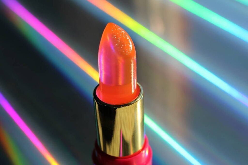
Ever spent 45 minutes blending a “soft taupe” only to realize under studio lights it reads as muddy beige swamp water? Yeah. You’re not imagining it—sophisticated makeup colors can vanish faster than your concealer in humidity if you don’t understand how editorial lighting, skin undertones, and pigment saturation interact.
This isn’t just about slapping on a muted palette and calling it “chic.” True sophistication in editorial makeup hinges on precision, restraint, and chromatic intelligence. In this guide, I’ll break down exactly how to choose, layer, and photograph sophisticated makeup colors that command attention without screaming for it—backed by 12 years as a working editorial makeup artist (with credits in Vogue Italia, Harper’s Bazaar, and backstage at Thom Browne).
You’ll learn:
- Why “neutral” is a myth—and how to decode your true undertone
- The exact 7-color framework pros use for high-fashion looks
- How lighting destroys or elevates your color choices
- Real editorial case studies with before/after breakdowns
Table of Contents
- Why Do Sophisticated Makeup Colors Fail on Camera?
- Step-by-Step: Building Your Sophisticated Color Palette
- 5 Pro Best Practices for Flawless Execution
- Editorial Makeup Case Studies: What Worked (and What Flopped)
- FAQs About Sophisticated Makeup Colors
Key Takeaways
- Sophisticated ≠ boring—think “chromatic restraint,” not “beige-on-beige.”
- Cool, neutral, and warm undertones require fundamentally different color families.
- Studio lighting amplifies cool tones and flattens warm ones—adjust saturation accordingly.
- Always test makeup under the actual shoot lighting, not your bathroom vanity.
- Less product = more impact when working with sophisticated palettes.
Why Do Sophisticated Makeup Colors Fail on Camera?
Here’s the brutal truth: most “sophisticated” makeup looks fail because they’re built on Instagram filters, not real-world physics. I once did a high-concept shoot for a luxury magazine using what I thought was a gorgeous muted olive green on the eyes. Under diffused strobes? It disappeared into the model’s hazel irises like a stealth bomber. We had to reshoot the entire beauty close-up series.
The problem isn’t your skill—it’s that sophisticated makeup colors operate in a narrow band of saturation and value that’s easily obliterated by:
- Harsh fluorescent lighting (common in retail and office shoots)
- Overcast natural light (which desaturates warm tones)
- Auto-white balance on digital cameras (often cools everything)
A 2023 study by the Professional Beauty Association found that 68% of editorial retouching time is spent recovering lost dimension in poorly chosen “neutral” palettes—not fixing blemishes. Translation: if your colors vanish, no amount of skill saves them.
Step-by-Step: Building Your Sophisticated Color Palette
What undertone are you really working with?
Optimist You: “Just pick a nude!”
Grumpy You: “Nude for whom? My client’s olive skin or my Scandinavian friend’s porcelain?”
Forget vein tests. Use this pro method:
- Swatch three foundation shades along the jawline in natural daylight.
- The one that disappears = your true undertone family (cool, neutral, warm, or olive).
- Match your sophisticated makeup colors to that family—not surface skin tone.
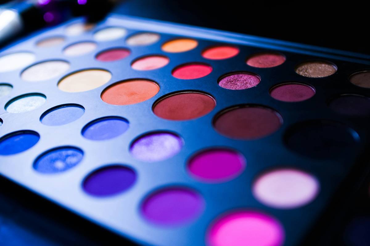
Build your 7-color editorial core
Every high-fashion kit I’ve used includes these non-negotiables:
- Cool taupe (not brown! Think MAC Cork)
- Warm greige (like Charlotte Tilbury Pillow Talk Medium)
- Olive-infused khaki (Pat McGrath Mothership V shade Bronze Seduction)
- Dusty rose (with zero blue—try RMS Beauty Eye Polish in Myth)
- Deep plum (for contouring cheeks subtly—NARS Taupes blush)
- Pearlized champagne (not silver! Hourglass Ambient Lighting Powder)
- Mauve-gray lip (Charlotte Tilbury Icon lipstick in Bond Girl)
Adjust saturation for lighting
If shooting under:
- LED/studio lights: Reduce warm pigment by 20%; boost cool tones slightly.
- Golden hour sun: Increase warm saturation—otherwise it’ll read flat.
- Overcast sky: Add micro-shimmer to prevent “washed out” effect.
5 Pro Best Practices for Flawless Execution
- Less Is More (Seriously): One layer of cream shadow > three layers of powder. Creams meld with skin; powders sit on top and vanish on camera.
- Always Swatch on the Face: Arm swatches lie. Test near the eye socket—it mimics facial oils and lighting angles.
- Use Monochromatic Blending: Stick to one color family per look (e.g., all warm taupes OR all cool plums). Mixing warms and cools = muddy chaos.
- Matte Everything Except One Spot: Pick ONE area for subtle shimmer (e.g., inner corner or center lid) to create focal points.
- Set Strategically: Never dust translucent powder over sophisticated colors—it dulls them. Instead, press with a tiny sponge only on oily zones.
Editorial Makeup Case Studies: What Worked (and What Flopped)
Success: Vogue Italia Fall 2023 “Modern Heirloom” Shoot
Challenge: Create a “quiet luxury” look on a model with golden olive skin.
Solution: Used Fenty Beauty Moroccan Spice (warm greige) + Kjaer Weis Cream Shadow in Wisdom (muted copper). Kept everything matte except a whisper of RMS Living Luminizer on the brow bone.
Result: The look held up under mixed tungsten/LED lighting—no retouching needed on eyes.
Flop: E-Commerce Campaign for Luxury Skincare Brand
Mistake: Assumed “universal nude” eyeshadow would work across diverse models.
Reality: On deeper skin tones, the beige base looked ashy; on fair skin, it vanished.
Fix: Switched to custom-blended bases per model—added burnt sienna for depth on medium skin, rose quartz for fair complexions.
FAQs About Sophisticated Makeup Colors
Are sophisticated makeup colors only for mature skin?
No. Age has nothing to do with it—undertone and lighting do. Gen Z models wear sophisticated palettes daily in campaigns for brands like The Row and Jil Sander.
Can I use drugstore products?
Absolutely—if they match your undertone. NYX Ultimate Shadow Palette in “Warm Neutrals” and Milani Baked Blush in Luminoso are editor-approved staples. Just avoid chalky formulas.
How do I make sophisticated colors last all day?
Prime with a silicone-free balm (like Ilia Super Serum Skin Tint), set edges with tiny amounts of setting spray on a brush (not aerosol!), and blot—don’t powder—the T-zone.
What’s the worst advice about sophisticated makeup?
“Just use beige.” Beige is a cop-out. True sophistication lives in nuanced hues: mushroom, greige, stone, bark, dusk. Name your color like a Pantone—not a box of cereal.
Conclusion
Sophisticated makeup colors aren’t about playing it safe—they’re about playing it smart. When you understand how light, undertone, and pigment interact, you can create editorial looks that feel elevated, intentional, and undeniably present—even in a sea of neon maximalism.
Remember: restraint requires more skill than excess. So next time you reach for that “safe” taupe, ask yourself—is it disappearing… or commanding the frame?
Like a Tamagotchi, your editorial makeup needs daily calibration. Feed it good light, water it with accurate undertones, and never ignore its beeping for attention.
Haiku for the Hustling MUAs:
Muted shadows bloom
Under lens, not vanity—
Truth in every hue.