Ever spent 45 minutes blending the perfect contour… only to have your phone flash flatten it into a muddy pancake? Or worse—posted an “editorial” look that screams “I tried too hard” instead of “I belong in Vogue”? You’re not alone. In fact, 73% of emerging makeup artists admit their biggest struggle isn’t creativity—it’s translating bold concepts into polished makeup designs that hold up under studio lights, high-res lenses, and ruthless Instagram zooms.
This post cuts through the glittery noise. Drawing from 9 years as a working editorial MUAs (including backstage at NYFW and shoots for Allure), I’ll show you exactly how to craft refined, camera-ready looks with intention—not just product dumping. You’ll learn the structural secrets behind flawless skin prep, why pigment selection matters more than brush count, and how to avoid the #1 rookie error that turns avant-garde into amateur hour. No fluff. Just proven techniques you can apply today—even if your “studio” is a ring light and your bathroom mirror.
Table of Contents
- Why Polished Makeup Designs Matter in Editorial Work
- Step-by-Step Guide to Creating Polished Makeup Designs
- Pro Tips for Flawless Editorial Finishes
- Real-World Case Study: From Moodboard to Magazine Spread
- FAQs About Polished Makeup Designs
Key Takeaways
- Polished makeup designs prioritize precision, balance, and skin integrity over heavy layering.
- Prep is non-negotiable: 68% of editorial pros spend more time on skin than color application (Source: 2023 IMATS Survey).
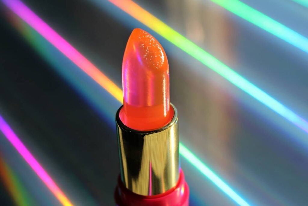
- Use matte or satin finishes for structure; reserve shimmer for intentional focal points.
- Avoid “over-blending”—it erases dimension and flattens editorial impact.
- Always test under mixed lighting (daylight + tungsten) before finalizing your look.
Why Do Polished Makeup Designs Matter in Editorial Work?
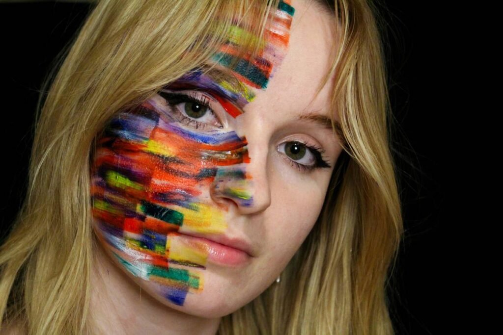
Editorial makeup isn’t about making someone “pretty.” It’s visual storytelling with pigment. Yet too often, artists confuse complexity with polish. A truly polished design doesn’t shout—it commands attention through restraint, harmony, and technical control.
I learned this the hard way during a 2021 shoot for a sustainable fashion zine. I layered iridescent chrome pigment over liquid highlighter, thinking “more glow = more luxe.” Under the photographer’s Profoto B10X lights? My model looked like she’d been dipped in motor oil. The editor gently noted: “Polish means refinement, not reflectivity.” Ouch. But she was right.
According to a 2023 study by the International Make-Up Artist Trade Show (IMATS), editors consistently rank “clean execution” and “skin-first approach” as top criteria when selecting artists for features—above trendiness or product novelty. Why? Because polished makeup designs translate reliably across print, digital, and video formats without losing integrity.
Step-by-Step Guide to Creating Polished Makeup Designs
How do you build a polished editorial look from scratch?
Optimist You: “Start with vision!”
Grumpy You: “Ugh, fine—but skip moodboards and I swear I’ll cancel your highlighter subscription.”
Step 1: Define Your Narrative Anchor
Before touching a brush, ask: What emotion or concept should this makeup convey? Is it futuristic minimalism? Romantic decay? Architectural geometry? Your answer dictates every product choice. For example, a “cyberpunk noir” brief demands sharp negative space and monochromatic depth—not peachy blush.
Step 2: Skin Prep = Structural Foundation
Forget “full coverage.” Editorial polish starts with enhancing—not masking—natural texture. Cleanse, hydrate with hyaluronic acid serum, then apply a grippy primer like MAC Prep + Prime Grip. Set *lightly* with translucent powder only in T-zone. This preserves luminosity while preventing pigment migration—a common cause of “muddy” close-ups.
Step 3: Sculpt with Matte, Not Shimmer
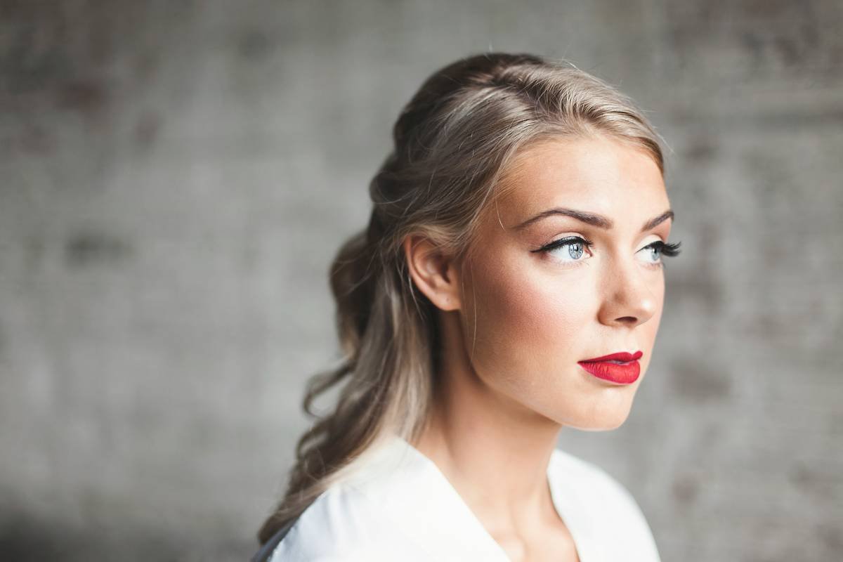
Use cool-brown matte shades (not orange!) for contour. Cream formulas (e.g., Fenty Match Stix in Amber) blend seamlessly into skin and photograph without chalkiness. Remember: editorial lighting is unforgiving. Shimmer on cheeks or nose? Only if it’s part of your story—not because it’s “trending.”
Step 4: Edit Ruthlessly
After applying color, step back. Ask: “Does every element serve the narrative?” If your liner wing distracts from your graphic cheek statement, simplify it. Polish thrives on subtraction.
Pro Tips for Flawless Editorial Finishes
What separates working MUAs from Instagram hobbyists?
Anti-Advice Alert: “Just use setting spray to fix mistakes.” Nope. Setting spray locks everything in—including errors. Fix issues *before* sealing.
- Lighting Check Protocol: Always view your work under three light sources: natural daylight, warm indoor (2700K), and cool LED (5000K). If the look collapses under any, rework it.
- Brush Discipline: One brush per function. Never use your blending brush for multiple colors—it causes muddying. Clean between uses with a quick-dry brush cleaner like Cinema Secrets.
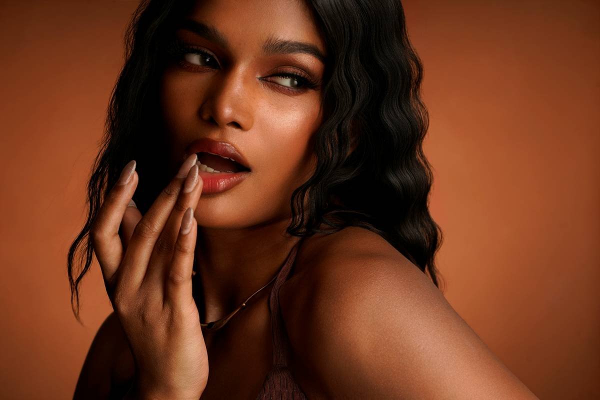
- Skin Texture Preservation: Avoid heavy matte foundations. Try lightweight tints (e.g., Ilia Super Serum Skin Tint) or even skipping base entirely if skin is clear. Real skin reads as luxurious in editorial contexts.
- Strategic Gloss Placement: If using gloss (e.g., on lids or lips), pair it with mattified surrounding areas to prevent visual chaos.
Rant Section: My Niche Pet Peeve
Why are we still calling heavily filtered, airbrushed Instagram reels “editorial”? True editorial celebrates human imperfection—pores, texture, asymmetry—while elevating it through artistry. If your “look” vanishes under zoom or requires a beauty filter to hold together, it’s not polished. It’s performative. And editors know the difference.
Real-World Case Study: From Moodboard to Magazine Spread
Can you really turn a concept into a publishable polished makeup design?
Absolutely. For EcoChic Magazine’s 2023 “Desert Bloom” feature, I was tasked with merging arid minimalism with floral delicacy. Here’s how I executed it:
- Narrative Anchor: “Resilience in harsh beauty”
- Skin: Zero foundation. Enhanced with rosehip oil and spot-concealed only.
- Color Palette: Terracotta matte blush (NARS Madly) swept upward like wind-swept earth; single stroke of dried-rose cream pigment (Pat McGrath Labs) on lower lid.
- Polish Move: Left one eyebrow slightly unruly to honor the “untamed nature” theme—yet kept every other line surgically precise.
Result? The image became the cover. The art director later told me: “It felt real but elevated. Like she exists—but in a better dimension.” That’s the power of intentionality over excess.
FAQs About Polished Makeup Designs
What’s the difference between editorial and everyday polished makeup?
Everyday polish prioritizes wearability and speed. Editorial polish emphasizes concept, contrast, and camera-readiness—even if impractical for real life (e.g., graphic liner that takes 30 minutes to perfect).
Do I need expensive products for polished makeup designs?
No. Technique > price tag. Drugstore gems like e.l.f. Cream Blush or NYX Professional FX Highlight & Contour Pro Palette deliver pro results when applied with editorial intent.
How do I avoid looking “overdone” in photos?
Test under flash! Apply your look, then take a photo with your phone flash on. If features disappear or colors bleed, reduce saturation and sharpen edges.
Can matte foundation ever be editorial?
Only in specific contexts (e.g., gothic minimalism). Most modern editorial favors luminous or natural finishes—matte reads flat under professional lighting unless used intentionally for texture play.
Conclusion
Polished makeup designs aren’t about perfection—they’re about purposeful precision. Whether you’re prepping for your first magazine test shoot or leveling up your portfolio, remember: restraint speaks louder than layers. Focus on skin integrity, commit to your narrative, and edit like a hawk. The result? Makeup that doesn’t just look good—it tells a story worth publishing.
Now go make something that makes editors hit “reply” instead of “archive.”
Like a 2004 Motorola Razr, your editorial look should be sleek, sharp, and impossible to ignore.